Library of logos and graphic standards

Graphic standards
Please respect the minimum spacing margins around the PurNat logo.
Colors
To maintain the reputation of the PurNat logo, the use of blue should be preferred at all times. It is important to use the logo on a background that allows good readability. The logo should never be framed. The use of black is recommended when the background color threatens to alter the legibility of the logo. White is accepted when neither blue nor black provide good reading.

Typography
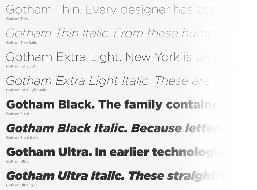
The logos of PurNat and its various components use the second stylistic set of the Gotham typeface. The use of any other font is prohibited.
TOGETHER LET'S CLEAN UP CANADA WITH PurNat
The TOGETHER LET'S CLEAN UP CANADA WITH PurNat logo is available in PNG format (transparent background) and in vector format (.EPS).


